The web has a diverse global audience and the websites and apps we build have to cater towards a wide range of languages, scripts and dialects. Developing for multiple languages isn't as simple as bashing the text onto the page though. As developers, we need to take extra care to present multi-lingual content in the most natural way possible. Fortunately, HTML and CSS present us with a few options to enhance the reading experience of our users.
If you find yourself needing to design or develop content to work in multiple languages, here are five tips and gotchas that might help things run more smoothly:
1. Fonts and diacritics. permalink
Have you ever heard the works of the Czech composer Antonín Dvořák? Perhaps you might have visited the beautiful Latvian city of Rīga, or strolled lazily through the Champs-Élysées in Paris?
Ok, so contrived example text aside, choosing a webfont with wide accent (or 'diacritic') support can be a real quick-win when designing for multi-lingual content.
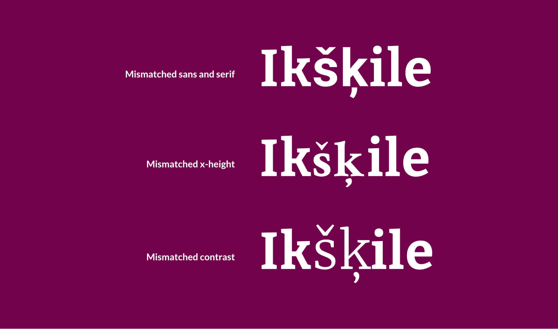
It's easy to take for granted, but not all fonts cover the full range of diacritic marks and this can be particularly noticeable with brand or display fonts. In fact, a quick look at Google Fonts shows that even some of the most popular webfonts struggle.
Wherever possible, make sure to check support before deciding on your webfonts. If you're stuck with a font that doesn't include the diacritics you need, you needn't worry though. In the event that your primary font doesn't include a particular diacritic mark, browsers will render the missing character with the next available font in your font-family stack.
To avoid harming your design with clunky, mismatched text like the example above, make sure that the fonts in your stack are as close a visual match as possible:
- Match the type of fonts. If your primary font is a serif, your fallback fonts should all be serif fonts. The same goes for for sans-serif or monospace fonts. Swap like for like.
- Match the x-height of your fonts to ensure the size is similar. Mismatched fonts might appear taller than others, leaving your content looking ragged or uneven.
- Match the contrast or weight of your fonts to ensure that missing characters don't appear thicker or thinner than the primary font
All of this might seem obvious but take a quick look through the font choices on Instagram stories and you'll see how easily font stack can slip through the net.
2. The lang attribute. permalink
Another useful tool for improving the semantics of multi-lingual content is the lang attribute.
The immediate benefit of setting a page-level lang attribute on the html tag is that search engines will know how to index your content. More importantly though, the lang attribute will inform assistive technologies such as screen-readers which accent and dictionaries to use when reading the content aloud. When a language code is combined with a regional subcode, for example en-GB, the results can get even more granular – as Michelle Barker writes, the subcode can also be used to specify the regional dialect of a screen reader.
Beyond assistive tech, setting the lang attribute is also beneficial to our CSS. When the attribute is set, we can use the :lang pseudo class to style content based on language. For example, the following CSS could be used to serve a specific font stack to any content that matches :lang(ar)
:lang(ar) {
  font-family: 'Noto Sans Arabic', sans-serif;
}
If you need more fine-grained control, the :lang selector also stacks codes and regional subcodes. With the following CSS snippet, content nested under a lang attribute of en-GB would be both blue and bold, but content with en-US would only be blue:
:lang(en) { color: blue; }
:lang(en-GB) { font-weight: bold; }
The lang attribute and character sets. permalink
There's one last feature that the lang attribute provides for CJK languages in particular that might not be immediately obvious to people unfamiliar with those languages.
Chinese, Japanese and Korean all use idographic characters but, as with all languages, usage has changed over time and so have the characters themselves. A hanzi character used in traditional Chinese, might be considerably different to a Japanese kanji or Korean hanja character of the same meaning. In a attempt to minimise the number of character variations, the unicode maintainers decided that all variations should be linked together under a single unicode point. This was known as the Han Unification and it's pretty controversial.
Why does this matter for typesetting on the web? Let's take a quick look – Below is the same character (U+8FD4) repeated five times:
Now let's try that again, but this time setting the lang attribute for each from left to right: Simplified Chinese, Traditional Chinese (Taiwan), Traditional Chinese (Hong Kong), Japanese, Korean.
  <span lang="zh-ZH">返</span>
  <span lang="zh-TW">返</span>
  <span lang="zh-HK">返</span>
  <span lang="ja-JP">返</span>
  <span lang="ko-KR">返</span>
Without setting the lang attribute, the browser doesn't have any knowledge of which language you are using and will default to its best guess. These characters might look similar, but they're distinct between languages. For speakers of CJK languages, a word or phrase displaying the wrong character variant might still be readable, but it will look a bit jarring.
Setting the lang attribute ensures that browser renders the character appropriate for the target language. It's also important to note that the region subcode of the language definition is helpful here too - zh-ZH, zh-TW and zh-HK are all under the zh macrolanguage code, but the character still differs by region.
All-in-all, the lang attribute is an vital tool in removing ambiguity from our multi-lingual content.
3. Direction and writing mode. permalink
Another common requirement of typesetting different languages is how to handle right-to-left scripts such as Arabic or Hebrew.
Simply entering RTL text will flow the text properly, but the alignment of elements to the page itself will be off:
أنا أسف ، لا اتكلم عربي جيدا
<p lang="ar"> أنا أسف ، لا اتكلم عربي جيدا</p>Fortunately HTML gives us a handy way to set the writing direction with the dir attribute. Setting dir="rtl" on the html tag will flip the text direction for the whole page, but you can also set it at text-level on individual elements. Let's take another look:
أنا أسف ، لا اتكلم عربي جيدا
<p lang="ar" dir="rtl"> أنا أسف ، لا اتكلم عربي جيدا</p>Much better!
There's more to text direction though – RTL is not the only alternative writing mode. Some scripts such as Japanese or traditional Chinese can have a vertical writing mode, written from top to bottom and from right to left. This was historically much harder to handle in CSS, and for a long time it was common to fake vertical text with a questionable combination of word-break: break-all and a width of 1ch. Fortunately with writing-mode gaining support in all major browsers, there's a better way. This property gives us the abillity to easily set lines of text to run vertically and in either direction. A value of vertical-lr sets it from top to bottom, left to right. vertical-rl flows lines of content top to bottom, right to left.
But how much of a difference does this actually make vs the 'creative' method of using word-break?
Take a look at the Japanese-language examples below. On the left is vertical text faked with word-break. On the right is text set correctly with writing-mode: vertical-rl. The differences might seem subtle at first, but they're immediately obvious to anyone who reads Japanese:
1980年代のストリートファッション
1980年代のストリートファッション
Ok, before we move on, you might have noticed the conspicuous split between controlling text direction with the dir attribute in HTML and then writing-mode in CSS. Personally, I find this to be a little confusing. Fortunately though, it looks like the CSS spec agrees and there is an experimental specification for writing-mode that will bring sideways-lr for LTR languages and sideways-rl for RTL languages. Currently this is only supported in Firefox, but here's hoping it gains wider support.
4. Logical CSS properties. permalink
Building on the last point, we can now get our text orientated properly. But what about padding and margin?
Traditional margin and padding CSS properties specify a direction: top, right, bottom or left. These are fine for LTR languages, but when writing mode changes, these properties won't take direction into account and may break your designs. Fortunately with CSS Logical properties, we now have access to direction-aware alternatives.
Where you would have previously used padding-left and padding-right, you can instead use padding-inline-start and padding-inline-end. Similarly for padding-top and padding-bottom you can now use padding-block-start or padding-block-end. The same pattern works for margins.
The great thing about these new properties is that for LTR languages, they're totally indistinguishable from the standard padding properties. Below is an example in English, the first uses padding-left and the second uses padding-inline-start.
Half-fat decaf soy-milk caramel latté
Half-fat decaf soy-milk caramel latté
<p lang="en" style="padding-left: 40px">Half-fat decaf soy-milk caramel latté</p>
<p lang="en" style="padding-inline-start: 40px">Half-fat decaf soy-milk caramel latté</p>
When you find yourself supporting an RTL language though, these new properties suddenly make all the difference. Let's compare:
القهوة العربية الأصيلة
القهوة العربية الأصيلة
<p lang="ar" dir="rtl" style="padding-left: 40px">القهوة العربية الأصيلة</p>
<p lang="ar" dir="rtl" style="padding-inline-start: 40px">القهوة العربية الأصيلة</p>
The huge benefit of using logical properties is even more obvious when using a vertical writing-mode. As with the previous examples, for the first example we're using padding-left and on the second we're using padding-inline-start:
水出しコーヒー
水出しコーヒー
At the time of writing, CSS Logical properties are really widely supported so there's every reason to start using them today. If you'd like to know more, you can read more about logical properties on MDN
5. Form validation. permalink
This last point is where things get a bit tricky. The main point of contention is that, as web developers we need form validation to keep the web secure. At the same time though, we need to be mindful that our security measures don't unintentionally alienate or block users from using our websites.
A cursory web search for name validation rules throws back regex patterns like this:
<input name="firstname" value="" required pattern="^[a-zA-Z ,.'-]+$" />This validation pattern definitely allows for a wide range of name punctuation but at the same time it would exclude a vast number of people who have accents, diacritics or non-Latin characters in their names. It's possible to extend this regular expression to include a wider range of accented characters, but making sure that all bases are covered can quickly become a maintenance nightmare.
A common approach to this challenge is to simply ask users to write their name without diacritics. Whilst this would certainly pass validation rules, this is not a true solution. Rendering a character without its diacritic can sometimes change the meaning of a word and names are a deeply personal thing that vary widely by culture and by language. Regardless of the intent, to build with assumptions on what constitutes a valid name risks excluding those who fit outside of those assumptions.
My recommendation for the most inclusive strategy? Make sure you do all of your usual security checks for script injection etc. but, wherever possible, don't validate the individual characters in a user's name. After all, as Patrick McKenzie wrote in the evergreen essay "Falsehoods programmers believe about names", it's near-impossible to get it right.
...Oh, and one last thing. If you absolutely have to validate names then make sure that any feedback messages put the blame firmly on your systems. Telling a user that their name is 'invalid' is rarely a good look.
Wrapping up. permalink
This post is just scratching the surface, but hopefully illustrates how important it is to handle multi-lingual content with care. Here's a quick summary of what we've looked at:
- Choose fonts with good support for accents and diacritics and build a solid font stack to handle missing characters
- Always set the
langattribute to let the browser know what language your content is in - Set horizontal text direction with the
dirattribute - Set vertical text direction with the
writing-modecss property - Use logical properties for padding and margins to ensure that layout changes won't break your design
- Where possible, avoid validating name inputs and write conscientious, user-friendly error messages
HTML and CSS will get us far, but it's worth noting that there are no one-size-fits-all solutions for getting multi-lingual content right. I'd still advise that, wherever possible have your work reviewed by a native-speaker. That goes double if you're developing content for a language that you yourself don't understand.
That said, over the years I've found that following these steps can provide a solid foundation for building flexible, multi-lingual content.